


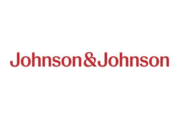
WASHINGTON, Sept 16 — In a significant departure from its iconic 135-year-old logo, Johnson & Johnson has unveiled a new corporate logo, reported dpa news agency.
The traditional cursive signature, reminiscent of co-founder James Wood Johnson’s handwriting, is being replaced with a contemporary font as the company shifts its focus toward medical devices and medications.
The corporate logo may change but consumers may not immediately notice the difference. The cursive logo will continue to adorn familiar consumer products like Band-Aid and Tylenol.
This change comes in the wake of Johnson & Johnson’s recent split into two separate entities: one focused on medical devices and medications and the other on consumer health products, operating under the brand name Kenvue.
The decision to introduce the Kenvue brand aligns with Johnson & Johnson’s strategy to shift the corporate identity into the background and allow their well-established product brands to take centre stage. This approach is reminiscent of other consumer product conglomerates such as Unilever, the parent company of Dove and Hellmann’s, and Procter & Gamble, which owns Bounty and Charmin.
Kenvue began trading as an independent company a few weeks ago.
The retirement of the signature J&J logo marks the end of an era, as the company once proudly claimed it was one of the world’s longest-used corporate emblems.
Over time, the new logo will gradually replace the old one on Johnson & Johnson’s medical equipment and pharmaceutical products.